Redesigned experience – Side-by-side comparisons
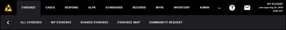
Navigation
The redesigned Axon Evidence introduces a collapsible sidebar that keeps navigation in one place. The sidebar makes it easier to scan available options, move quickly between them, and collapse the menu when you want a larger, cleaner workspace.
Legacy navigation
In the legacy experience, navigation was positioned across the top of the screen. Some options were hidden in that horizontal bar, so moving between different parts of Axon Evidence wasn’t always direct or intuitive.
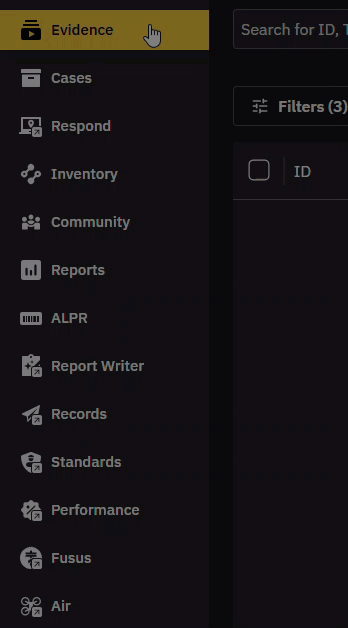
Redesigned navigation
The redesigned sidebar puts everything in one place, reducing effort and making it easier to move between tools.
- Always see where to go: The sidebar is always visible, and your current selection is highlighted in yellow.
- Open up space when you need it: Collapse the sidebar to give yourself more room to review evidence or cases.
- Scan and move faster: Everything is in one place, making it easier to find what you need.
Hover to view more options
Some sidebar items open directly and others include more options. Hover over an item to see those options.
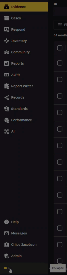
Expand or collapse the sidebar
You can expand the sidebar for full context or collapse it to maximize your workspace.
Search
Searching for evidence is simpler in the redesigned Axon Evidence. A single search bar and new filter panel bring everything together in one place. Results update instantly as you work, saved searches cut out repetitive setup, and continuous scrolling keeps you moving without interruption. With new tools like map search, you can now find and visualize evidence by location too.
Search bar
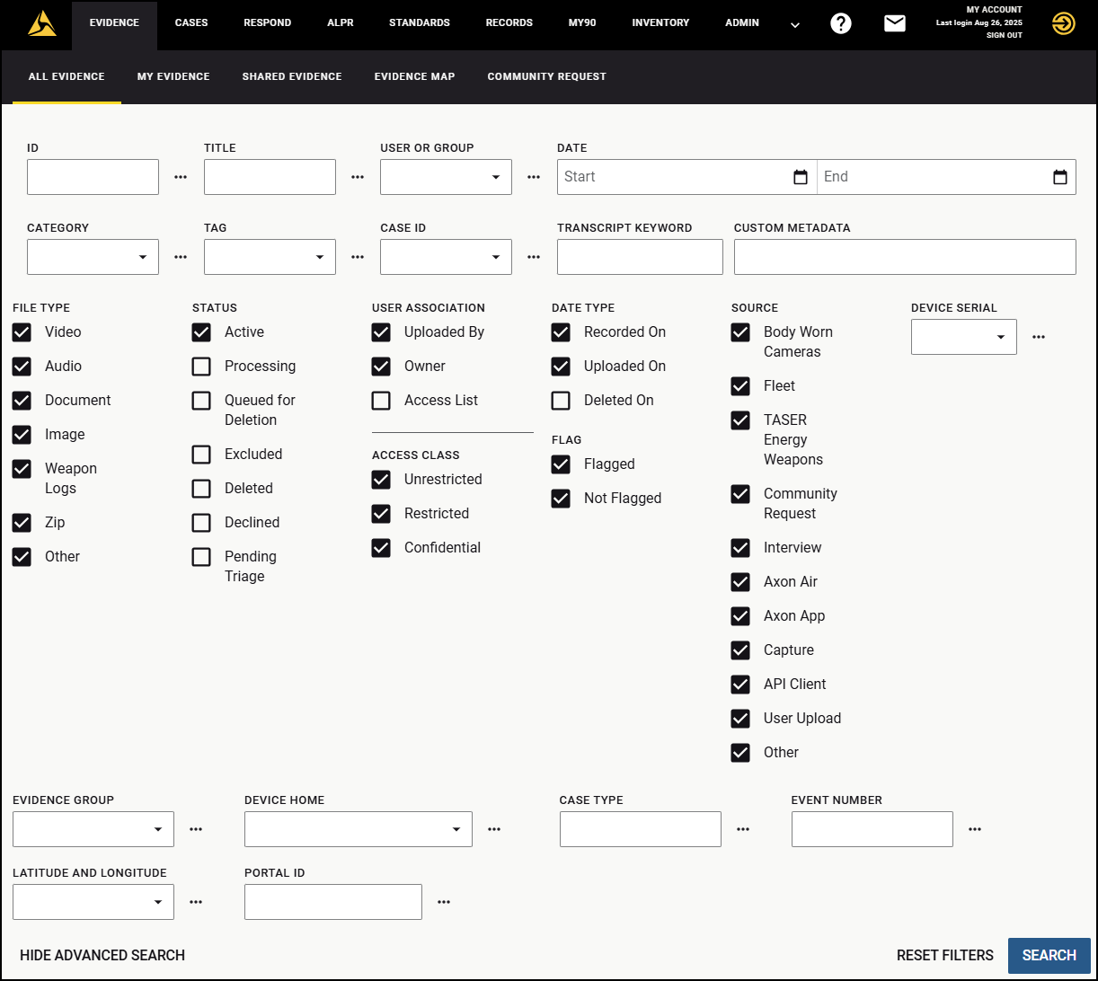
The evidence search page is where you begin looking for evidence. In the legacy experience, searches started by entering information into multiple filters. In the redesigned Axon Evidence, everything starts with a single search bar, so you can just start typing.
Legacy search
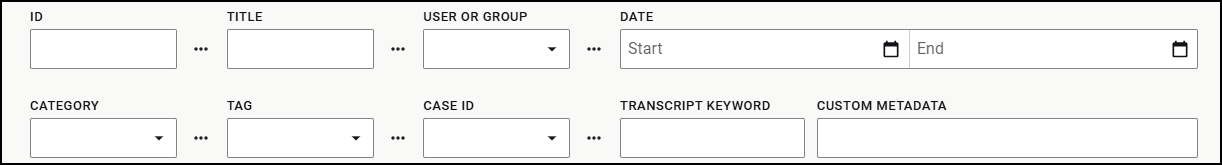
In the legacy experience, there was no single search bar. Searches started with multiple filters across the page with some hidden in an advanced search section. You had to decide where to start and often switch between sections to refine your search.
Redesigned search
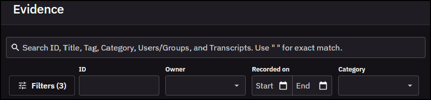
In the redesigned Axon Evidence, you start with one unified search bar. Enter a title, ID, category, case ID, user, group, or transcript keyword in a single place. Use quotation marks ( " " ) to search for an exact match.
Filters
Filters narrow down your results. In the redesigned experience, they are grouped together, making them easier to find, and results update as you go.
Legacy filters
Filters were split into basic and advanced sections. Basic filters were always visible, while the advanced filters required expanding a separate section of the page and scrolling to find what you needed.
Redesigned filters
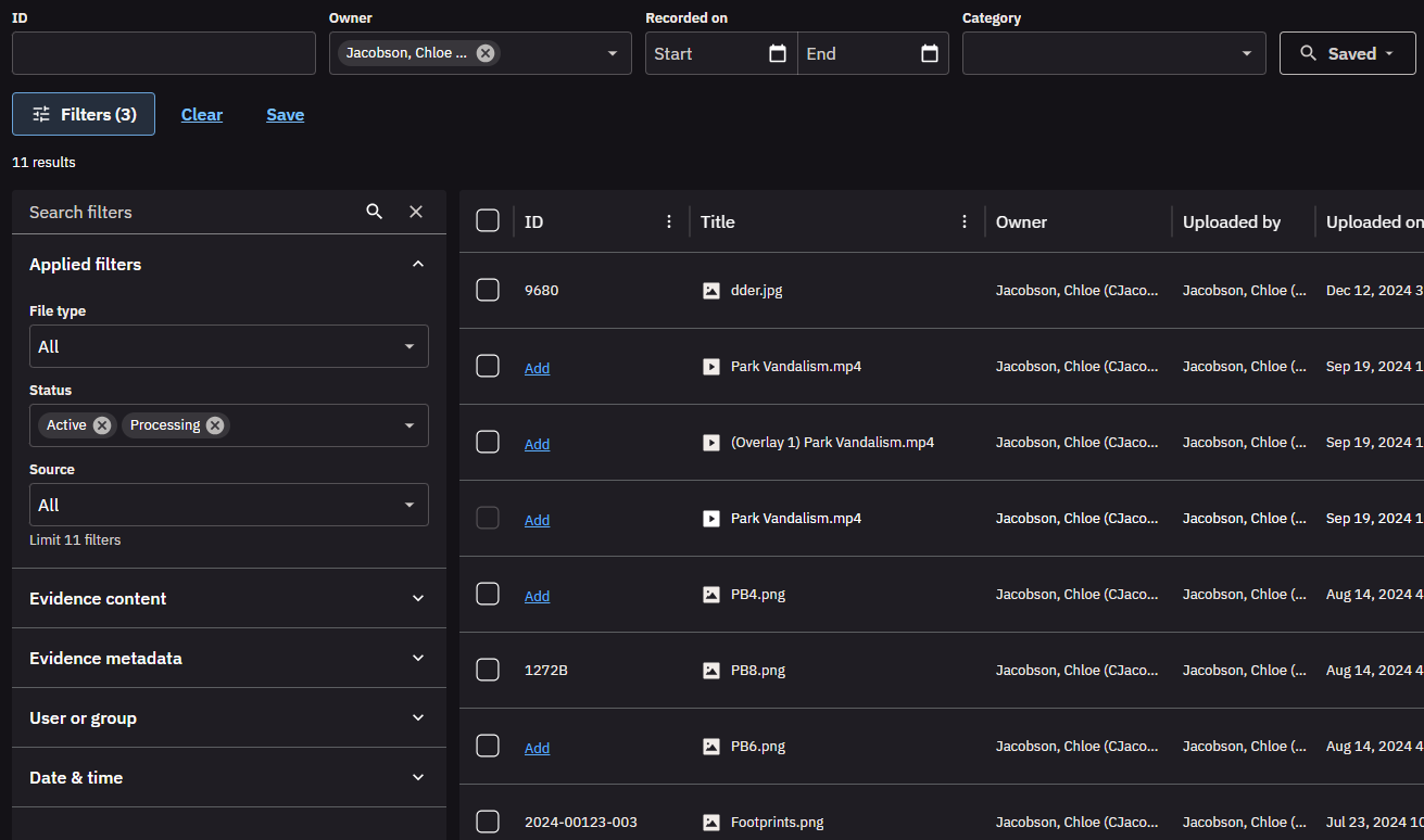
In the redesigned Axon Evidence, filters open in one clean panel, Applied filters move to the top so you can find them easily, and categories are grouped to make scanning easier. There' s also a search bar at the top of the panel, so instead of scrolling, you can enter a filter name to apply it quickly.
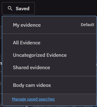
Saved search
Saved searches are new in the redesigned Axon Evidence. Instead of setting up the same filters every time, you can save you can save a search once and reapply it whenever you need, cutting out repetitive steps.
Search results list
The results list is where you view search results. In the redesigned experience, results load continuously and the table is easier to work with.
Legacy search results
Search results in legacy loaded in pages. To see more evidence, you had to select a page and wait for it to load.
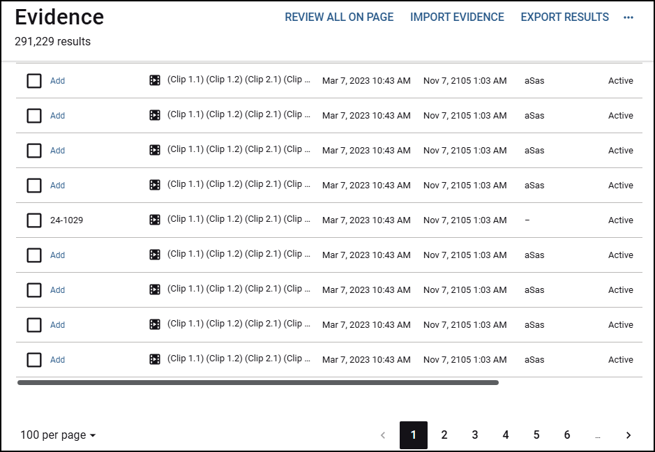
Redesigned search results
Results now load continuously as you scroll. Keep reviewing evidence without interruptions.
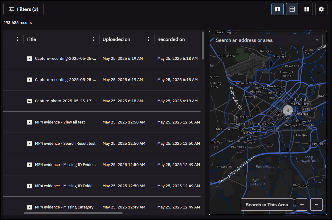
Map search
The new map search lets you see evidence by geographic location on an integrated map. Filter directly on the map, zoom into clusters, and review evidence in its spacial context.
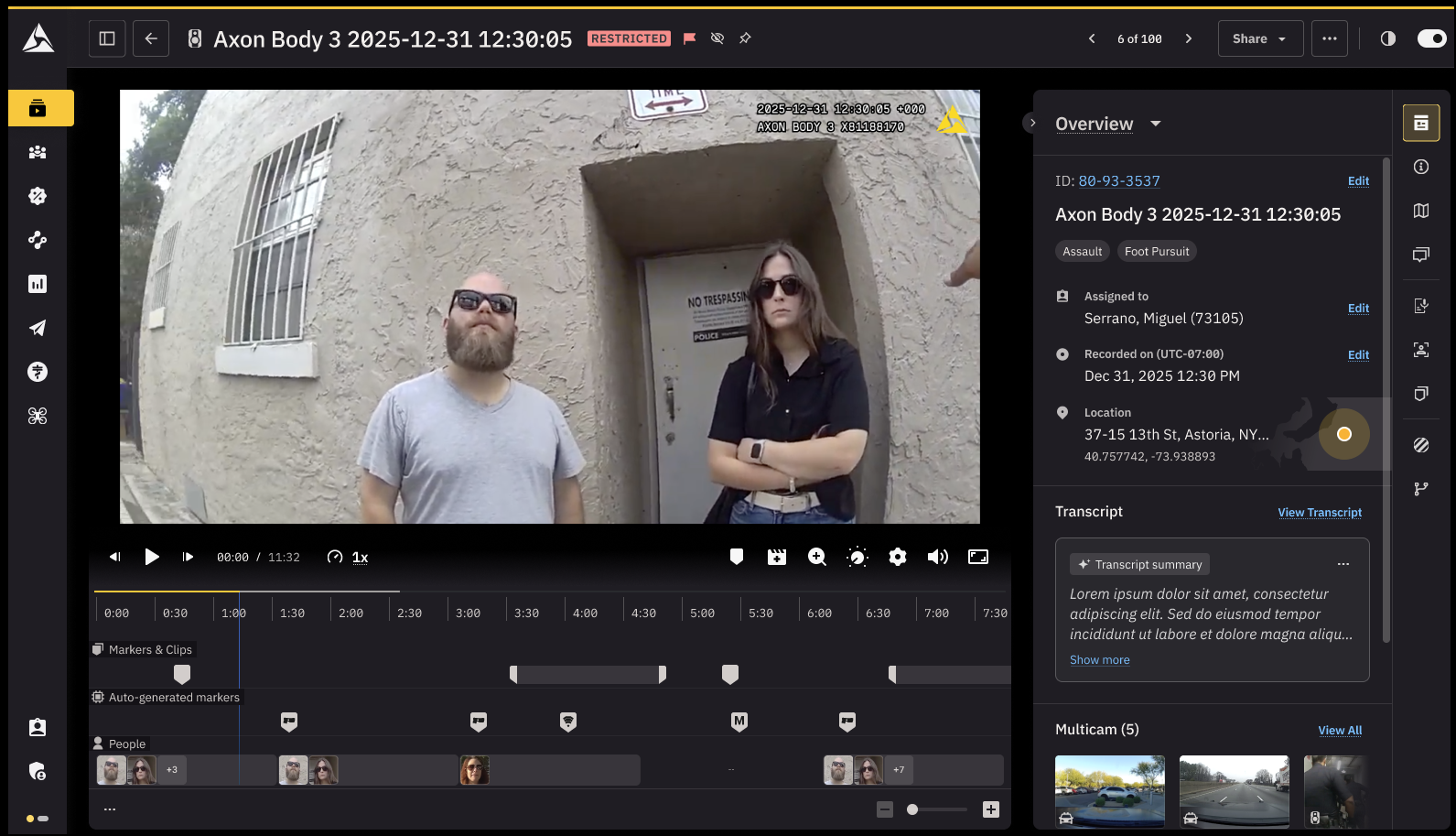
Evidence details page
The redesigned evidence details page gives you a faster way to view, manage, and take action on evidence. It groups critical tools and metadata into clear tabs and sections, so you can quickly get to what you need without a lot of scrolling or switching screens.
Layout and navigation
The page layout is now organized into sections and tabs that keep related tools and information grouped together. This makes it easier and faster to find what you need.
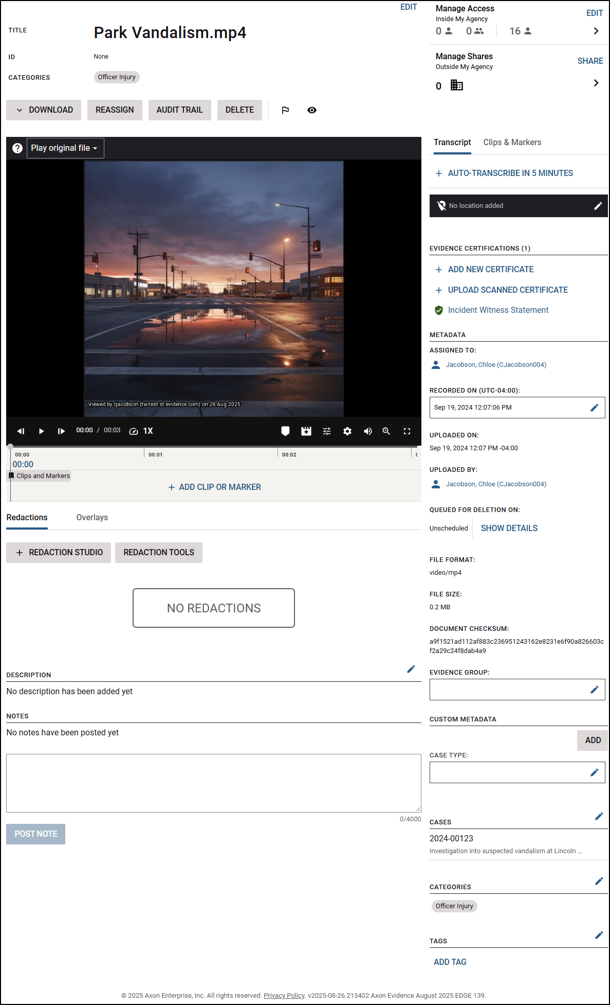
Legacy navigation
The legacy evidence details page was a single, scrollable view. Some features were hidden or opened in a separate pane.
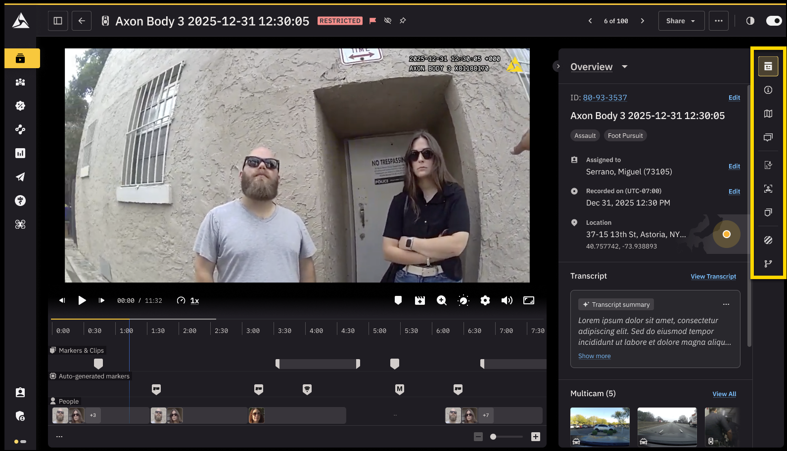
Redesigned navigation
The redesigned experience groups tools and metadata into tabs. This helps you find information faster, while keeping everything in one place.
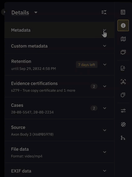
Metadata editing
Editing key metadata is still directly available on the page, but fields are now grouped in a way that is easier to scan and update.
Legacy metadata
Editable fields were visible on the page, but not grouped together. Locating and updating metadata often meant repeat scrolling.
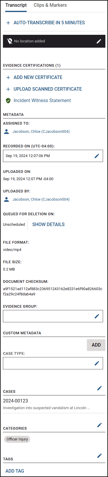
Redesigned metadata
In the redesigned Axon Evidence, metadata is now grouped together in expandable sections.
Tools and features
The evidence details page includes tools for reviewing, editing, and managing evidence. In the redesigned experience, these tools are organized into tabs so they are all accessed the same way and in the same place.
Legacy tools and features
In the legacy layout, tools like Redaction Studio, Notes, and Clips and Markers were available, but spread across different areas on the page.
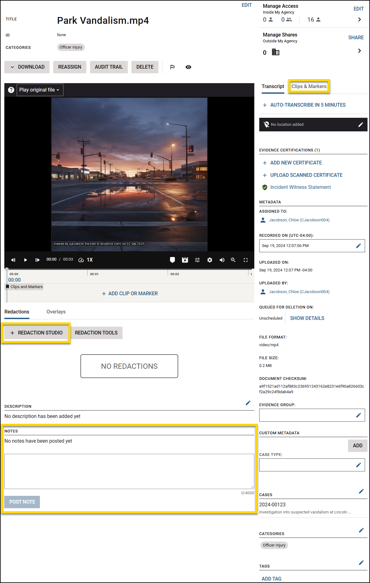
Redesigned tools and features
In the redesigned Axon Evidence, all tools appear as tabs alongside the evidence. You can now access everything form the same location, making it easier to find what you need without moving to different parts of the page.
Access control
Managing who can view and share evidence is now simpler. In the redesigned experience, internal access and external shares are consolidated in a Share menu, so you can control access from one place.
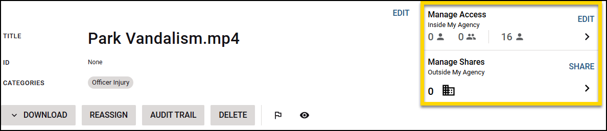
Legacy access control
Internal access and external shares were managed from a section on the page that opened a separate pane.
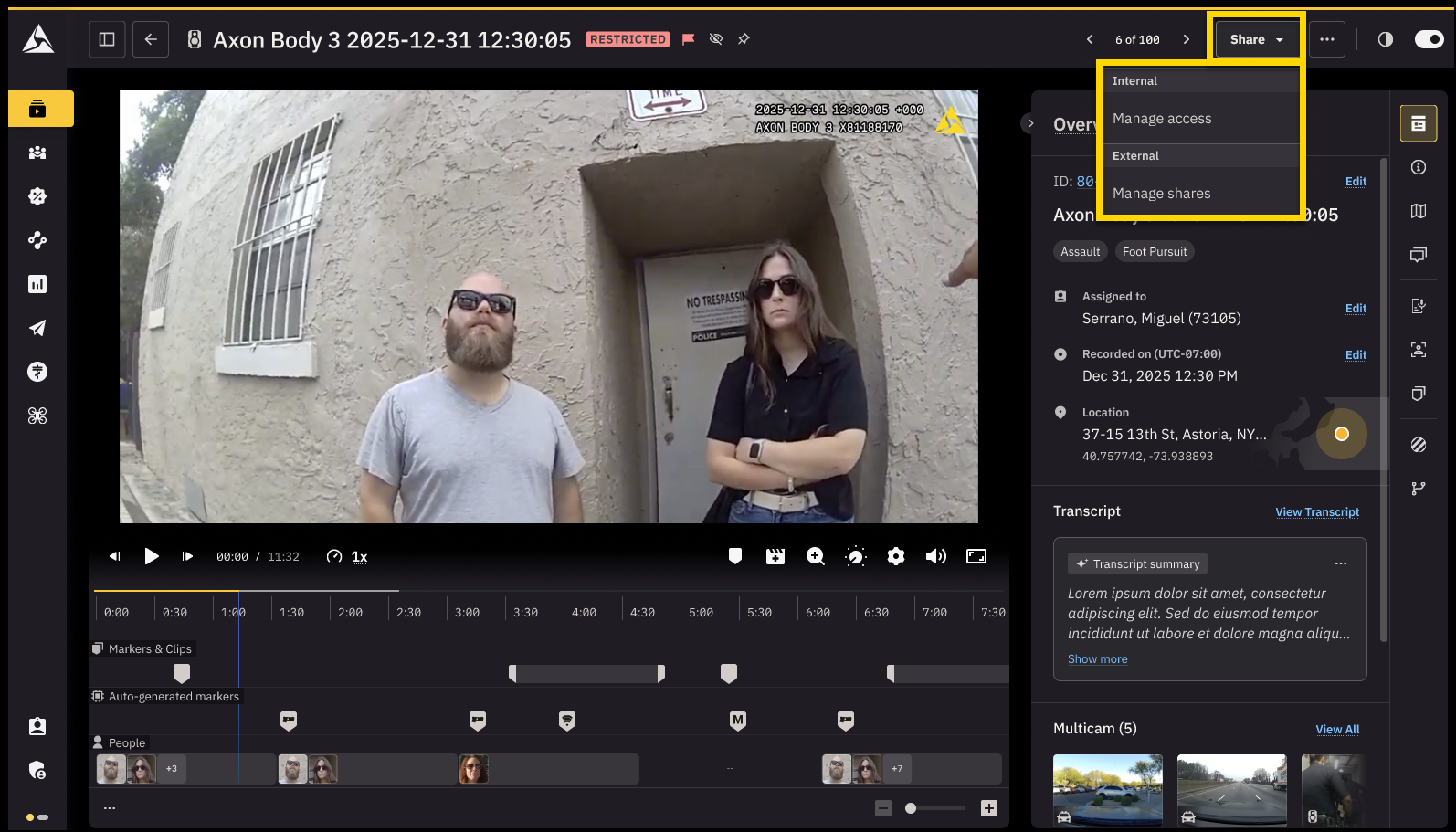
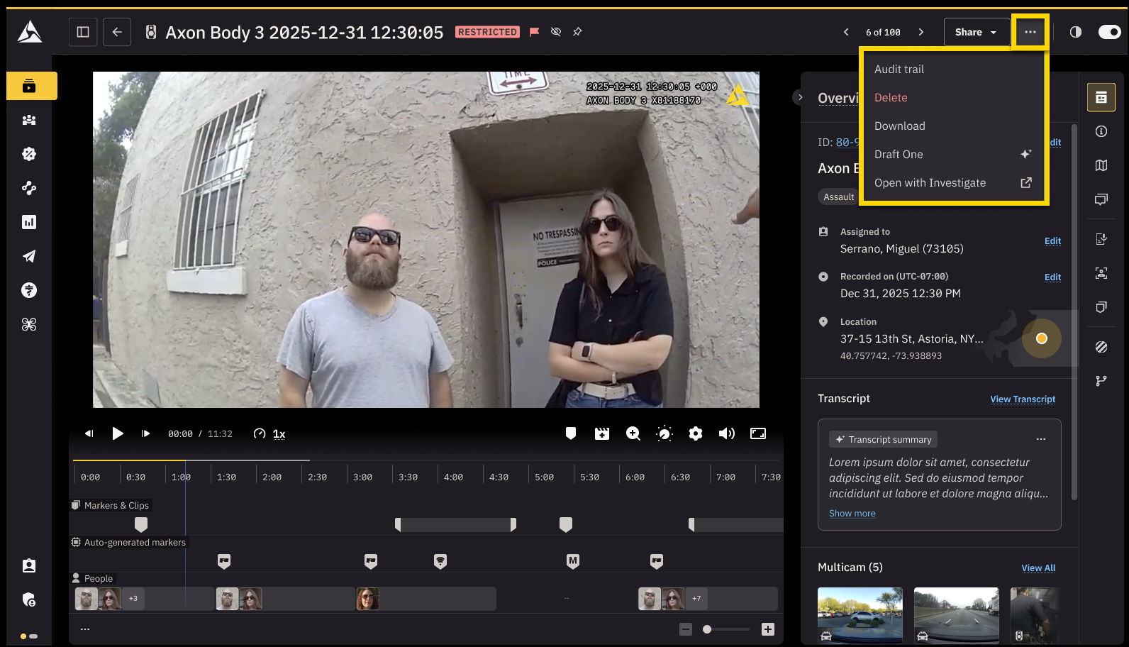
Redesigned access control
Access is now consolidated into a Share menu. Selecting an option from this menu opens a dialog box.
Actions
Quick actions like downloading, deleting, or viewing the audit trail are still available on the evidence details page, but the way you reach them is streamlined.
Legacy actions
More actions appeared as a row of buttons above the media player.
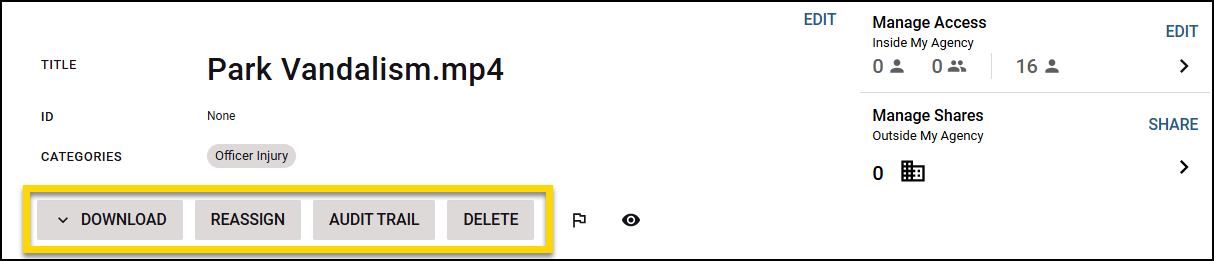
Redesigned actions
In the redesigned experience, these options are now grouped into a More actions (...) menu. The menu keeps the page uncluttered while still giving you quick access.
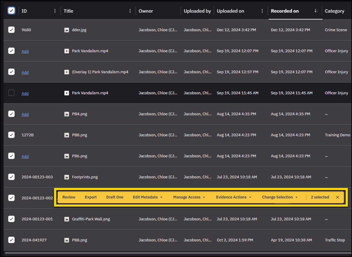
Bulk actions
Bulk actions let you work with multiple files at once, like downloading, editing metadata, or managing access. In the redesigned Axon Evidence, all bulk actions appear in one place so you can take action faster.
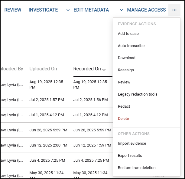
Legacy bulk actions
In the legacy experience, bulk actions were split across the page. Some bulk actions appeared as separate buttons, others were available in a More actions (...) menu.
Redesigned bulk actions
In the redesigned Axon Evidence, all bulk actions are consolidated into a single action bar. As soon as you select one or more evidence items from the list, the bar appears, giving you direct access to every available bulk action in one place.