Analytics
The Axon Analytics dashboards, accessed by selecting the data icon in the main navigation menu, let you take a closer look at the data being generated by your organization. A set of out of the box dashboards can be used and configured for your organization to help you make informed decisions.
You can interact with the various visuals in the dashboards as well as export them into various formats for sharing. Users with specific privileges can create, edit, and delete these dashboards.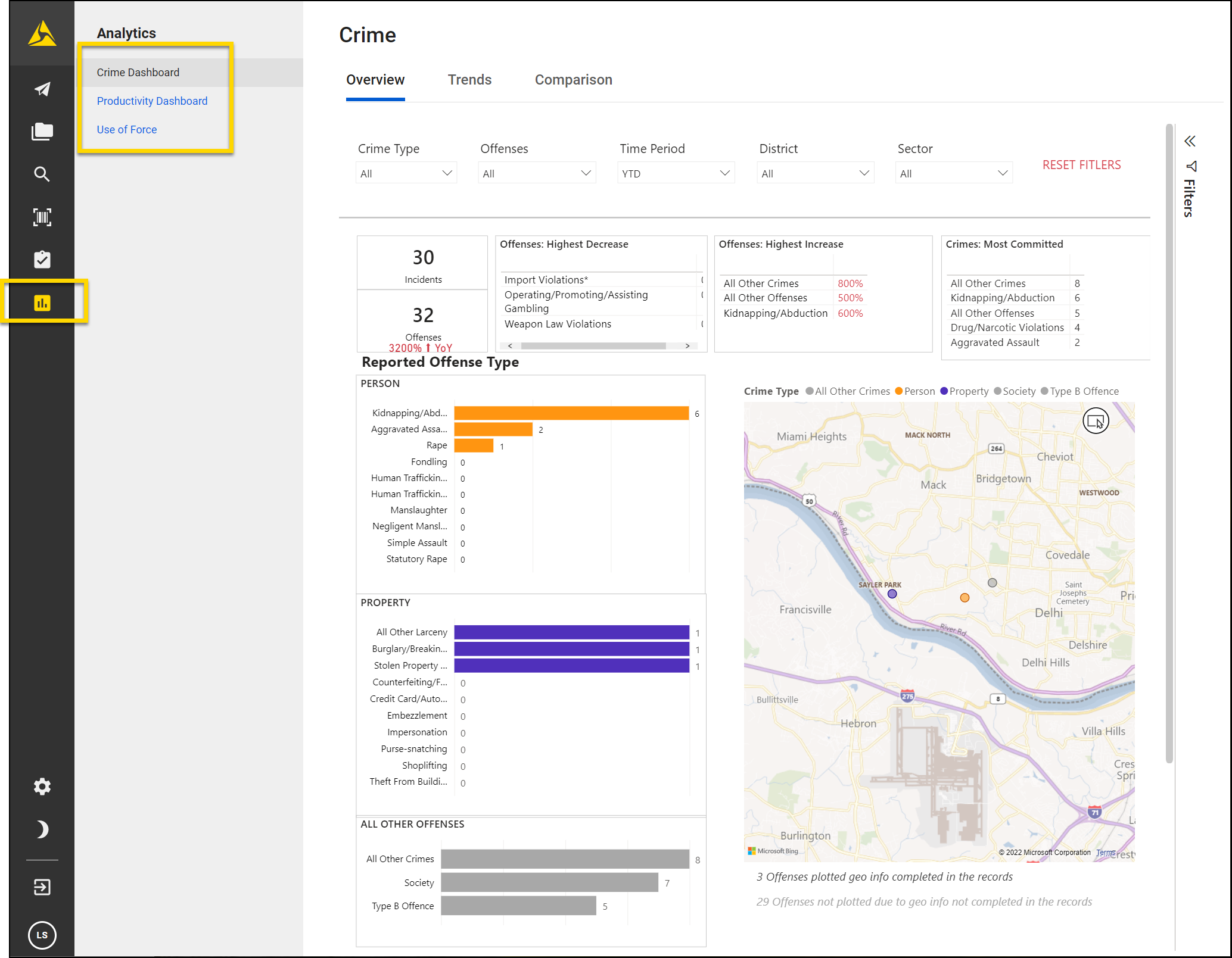
Out of the box dashboards
When your organization begins using the Analytics module, you can access a set of Out of the box (OOTB) dashboards. Contact your Axon representative or Axon Support if you want to adjust these dashboards.
A file containing example downloads of all OOTB dashboards can be found here.
The following dashboards are available in Axon Standards:
- Complaints (Internal/Citizen)
- EIS
- Report Productivity
- Use of Force/Response to Resistance
- Vehicle Collision
- Vehicle Pursuit
Complaints (Internal/Citizen)
The Complaints dashboard provides insights into internal and citizen complaint activity, offering overviews by case, officer, reviewer, and complainant demographics to support transparency, accountability, and trend analysis. This dashboard contains the following tabs:
- Complaints overview: High-level snapshot of complaint volume with counts for complaints and unique officers involved, a time series by month/year, map of complaint locations, and bar charts by allegation/resolution and actions taken; includes an incident table with event/date, location, report type, involved officers, complainants, and allegations.
- Complaints review: Review workflow view showing counts for complaints, unique officers, and unique complainants; visuals break complaints down by reviewer, reviewer-by-resolution, and involved officers by report type; detail table lists event/date, involved officer, allegation, resolution, action taken, reviewer, and complaint type.
- Officer complaint details: Officer-centric page with counts for complaints, unique officers, and unique complainants; chart of involved officers’ allegations by resolution; detail table per event showing involved officer, allegation, resolution, action taken, hours suspended, and complaint type.
- Citizen demographics: Complainant-focused view with counts for complaints, unique officers, and unique citizen complainants; charts for complainants by sex, race/ethnicity, and age bracket, plus allegations by resolution; “Citizen Details” table lists event/date and complainant demographics.
Early Intervention System (EIS)
The Early Intervention System dashboard can be accessed from the EIS module. This dashboard shows counts of EIS alerts (In Policy, Warning, Critical) for individuals over different lookback periods.
See Early Intervention dashboard for more information about using this dashboard to manage EIS alerts.
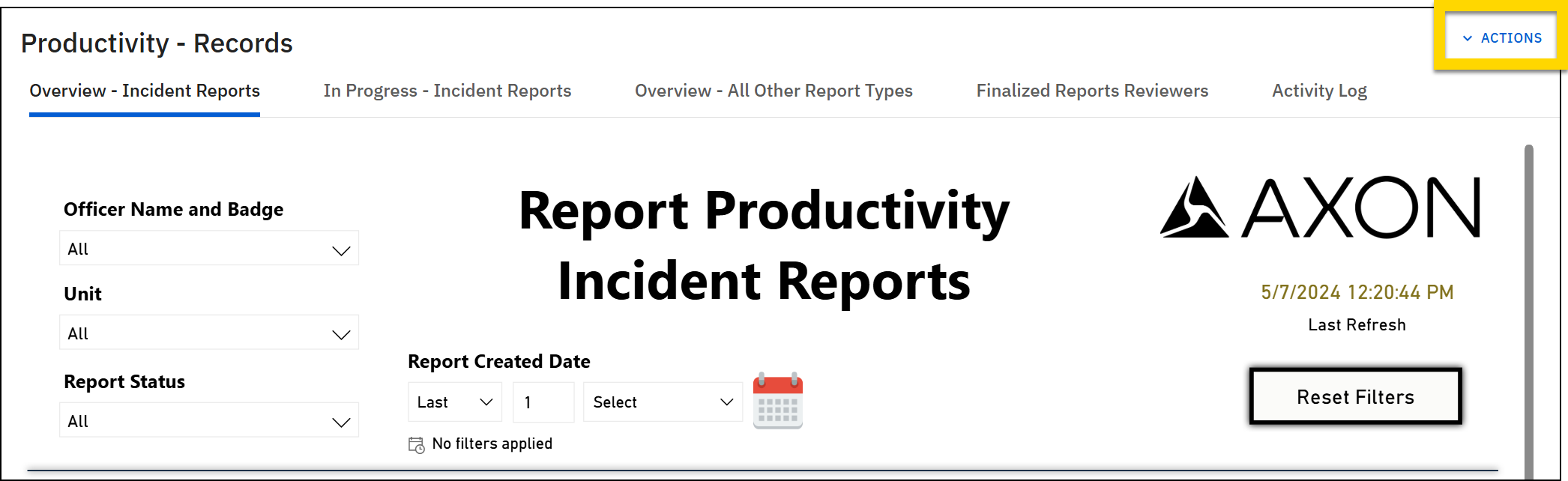
Report Productivity
The Productivity dashboard tracks report creation, review, and completion performance, highlighting timeliness, reviewer activity, and quality control across report workflows to support efficiency and accountability. This dashboard contains the following tabs:
- Report productivity — Overview: High-level snapshot of report volume and timeliness: counts by status (Draft, Supervisor Review, IA Review, Finalized), average days to finalize, trends by month/year, and a table listing reports with author, type, and workflow status.
- Reports in progress: Focuses on unfinalized work: current counts in each stage, trends over time, breakdowns by report type and primary assignee with average days in stage, plus a detailed “in progress” list (reviewer assigned, sent-to-review date, days in status).
- Report productivity — Finalized reports: Completion view: who approved what and when (Supervisor and IA Review panels), with a table of finalized reports showing created vs. finalized dates and days to finalize; filterable by reviewer, author, type, and date ranges.
- Report productivity — Rejected reports: Quality/control view: rejected count and rate, breakdowns by officer and supervising reviewer, and a detailed rejected-report list (report number, author, type, rejection instances), filterable by author, unit, supervisor, type, and dates.
Use of Force / Response to Resistance
The Use of Force/Response to Resistance dashboard provides a comprehensive analysis of force-related incidents, tracking usage patterns, subject and officer demographics, injuries, and trends to support transparency and informed oversight. This dashboard contains the following tabs:
- Force overview: Overview of total force incidents and applications, with visual analysis of force types, incidents, and related details.
- Force trends: Trends in force incidents and applications over time, with analysis by day, time, and dynamic filtering options.
- Force subject demographics and actions: Demographics of subjects involved in force incidents, including race, age, sex, homelessness, impairment, resistance, and actions.
- Officer demographics: Details on officers involved in force incidents, including race, rank, years of service, sex, and incident counts.
- Force subject and officer injuries: Summary and analysis of injuries to subjects and officers by severity, treatment, injury type, and force applied areas.
Vehicle Collision
The Vehicle Collision dashboard provides detailed insights into vehicle collision incidents, highlighting trends, participant demographics, officer involvement, and environmental factors to support analysis of safety, performance, and incident response. This dashboard contains the following tabs:
- Vehicle collision overview: High-level incident summary with KPIs for total incidents and damage, time series by month/year, a map of incident locations, and breakdowns by location, lighting, and weather. Useful for spotting trends and geographic clusters.
- Vehicle collision — Persons involved: Demographic and injury/safety-belt breakdown of people involved (sex, race/ethnicity, injured, seatbelt use, vehicle crash involvement) with a detailed table of each person per event. Useful for victim/participant analysis and safety insights.
- Vehicle collision — Officers involved: Officer-level view showing which units and officers responded or are assigned, counts of incidents and involved officers/persons, and incident details (weather, lighting, damage). Useful for workload, unit performance, and assignment reviews.
Vehicle Pursuits
The Vehicle Pursuit dashboard provides comprehensive analysis of vehicle pursuit incidents, including key metrics, suspect data, and temporal trends to support operational insight and accountability.
This dashboard contains high-level stats for Vehicle Pursuits, People Injured, Avg Highest Speed, Avg Length (mins). Includes a map of starting locations, reports by month/year, bar charts for incidents by reason started and reason ended, plus a detailed incident table. the dashboard also shows counts of Vehicle Pursuits, Suspects. Includes details for suspects by charge type, injured/not, injury type, sex, race; detailed suspect table (event/date, name/DOB, demographics, role, charges, injury status/type). Finally, the dashboard includes tables depicting Vehicle Pursuit reports by year/quarter/month, by day of week, and by hour of day.
General functionality
You can interact with Analytics dashboards in various ways, including:
- Actions
- Tabs
- Filters
- Tooltips
- Focus Mode
- Right-click
- Maps
Watch this video for an explanation of the content contained in the following sections.
Actions
Each dashboard contains an Actions menu you can open to:
- Create new dashboard:Create a new copy of the dashboard to edit and customize as desired.
- Edit dashboard: Edit the title, tabs, and visualizations for the dashboard.
- Create bookmark: Save a link to the page, including whatever filters you have set in your current session.
- Export dashboard: Export the dashboard as a PDF, CSV, or PPTX (Power Point) file.
Tabs
Each dashboard opens to an Overview tab. Select the names that appear to the right of the Overview tab to switch to tabs that contain different charts and data.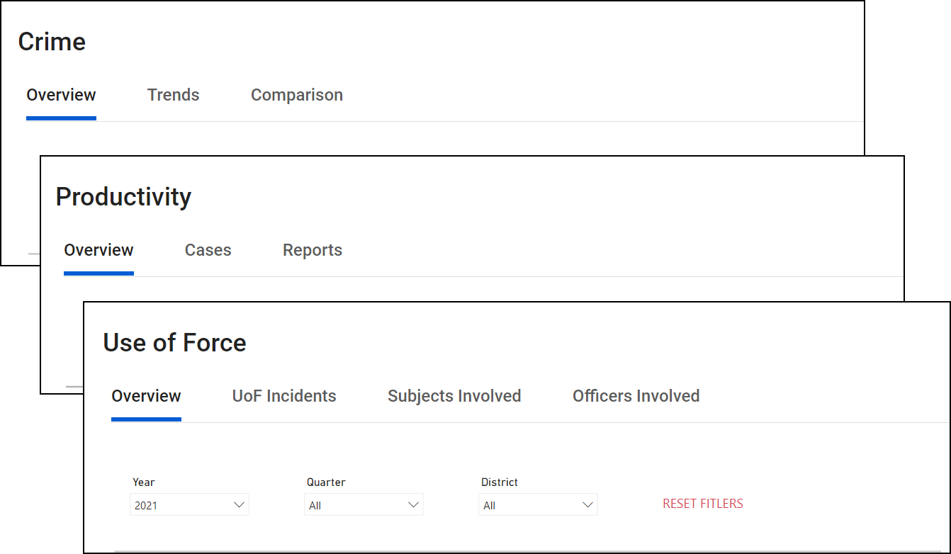
Filters
Use two different types of filters to adjust the data displayed in the dashboards:
- Choose from the drop-down filters at the top of the window
- Select a piece of data or chart section
Drop-down filters
Each dashboard has a different set of filters to choose from that allow you to refine the data that is displayed.
Hover over a filter and select the eraser icon to remove filters from that menu. Select Reset filters to remove all filters from all menus.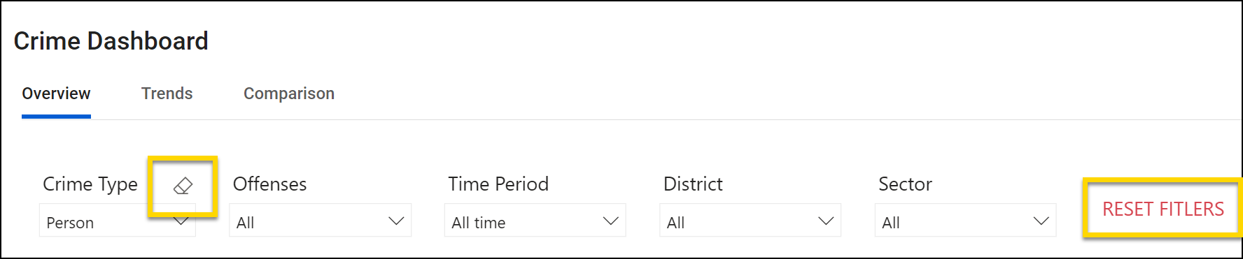
Chart filters
All visuals on a dashboard are connected. This means that if you select a piece of data or colored section of a chart, all data on the dashboard is filtered by that criteria.
For example, selecting one of the districts on the Use of Force Overview tab filters all charts to show data for just that district. The area that you selected will remain a dark color and all other districts will appear washed-out.
To remove the filter, select the data or chart section again or select Reset filters at the top of the window.
See Power BI's help documentation for additional details about filtering.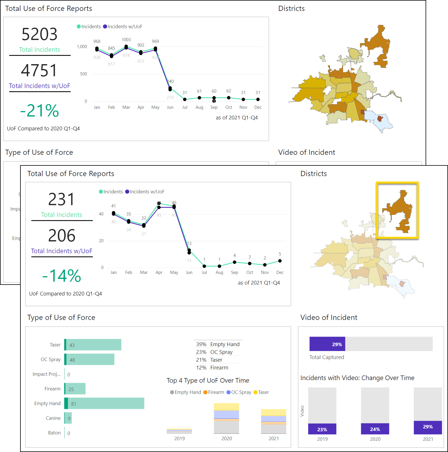
Tooltips
Hover over a section of a chart to reveal additional data: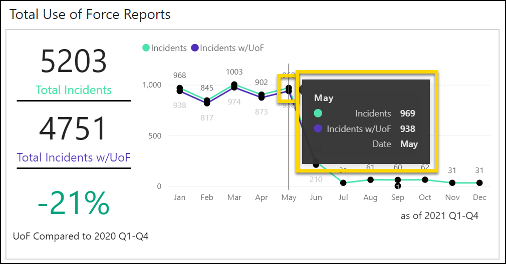
Focus Mode
Click on any chart to enter Power BI's Focus Mode and reveal additional options above the chart. Use these options to:
- Drill up or down
- View the filters that impact the visualization
- Spotlight the visualization
- Open Focus Mode, which reveals a larger version of the visualization
- Export the data for just that visualization
- Adjust the sorting axis or sort order
See Power BI's help documentation for additional information about Focus Mode.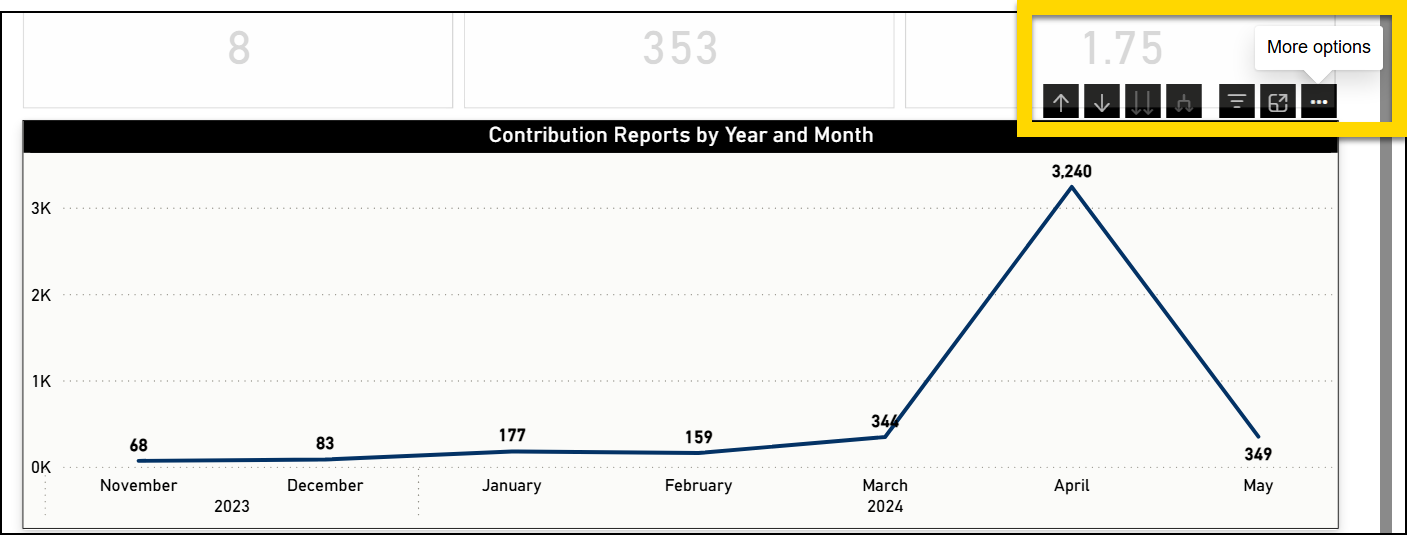
Right-click
Right-click on any chart to reveal additional drill-down options, including:
See Power BI's help documentation for additional information about drill-downs.
Show as table
Selecting this option reveals a larger version of the visualization, as well as a table version of all data. The Focus Mode options appear above the visualization. Select Back to report to return to the tab you were viewing.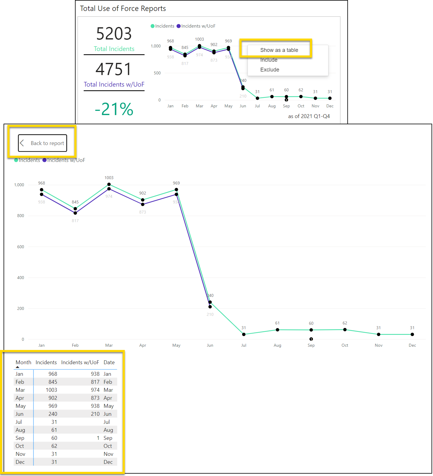
Include / exclude
If you want to include or exclude a piece of data from the displayed results, right-click on the piece of data / chart section and select Include or Exclude.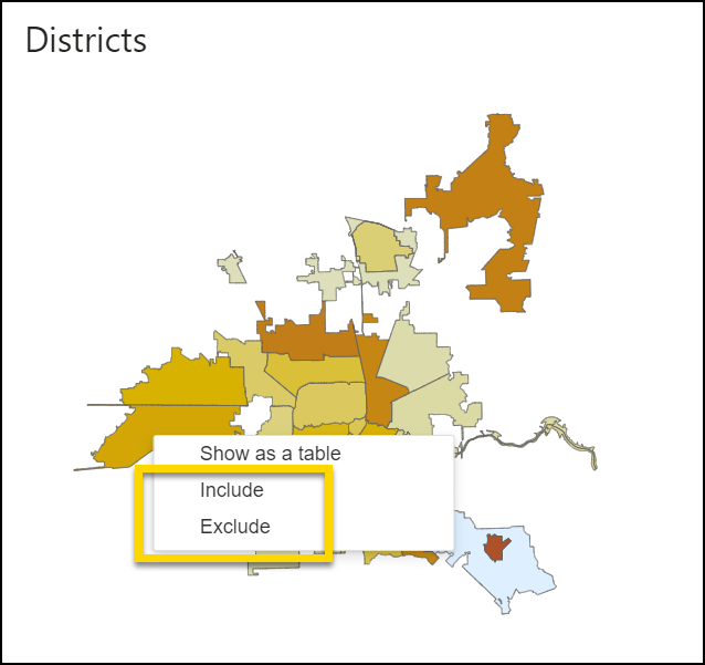
Copy
Right-clicking data that is presented in a table on the main dashboard tab reveals two copy options:
- Copy value: Copies the value of that cell. If the cell contains a percent, it will be converted to the decimal value.
- Copy selection: Copies the entire row. Unlike Copy value, percentages are not converted into decimals
After copying a value or selection, you can paste the data into another program or document by pressing CTRL + V (Windows) or CMD + V (Apple) on your keyboard.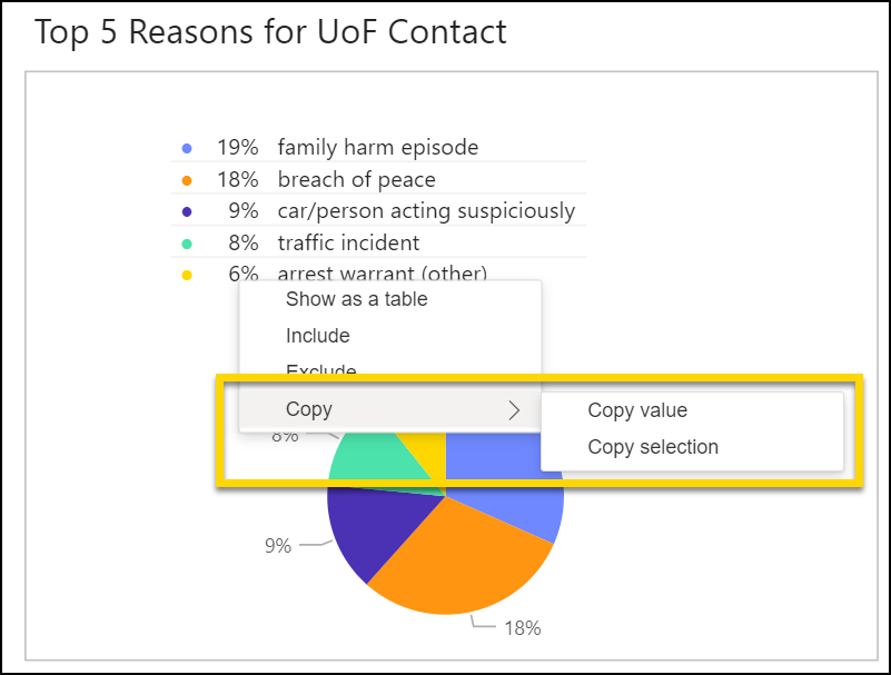
Maps
Several dashboards contain maps. Click and drag to adjust which section of the map is shown on the screen. Hover over the map and use the scroll wheel on your mouse to zoom in and out.
In the same way that selecting a chart or data section adjusts the information shown in all charts and graphs, selecting an area on a map adjusts all chart information. To do this, select the icon in to top right corner of the map. Your cursor will change to a cross that you can use to draw a square on the map.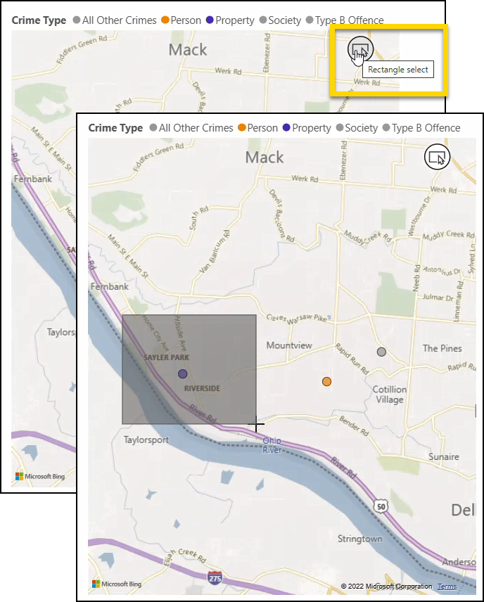
Export dashboards
To export an Analytics dashboard:
- Open the dashboard.
- Use the filters to set which data to include in the export.
- Select Actions > Export dashboard.
- Select a format for the export:
- CSV: A separate CSV file is exported for each table/matrix in the dashboard.
- PDF: Each dashboard tab exports to a separate page in the PDF.
- PPTX: Each dashboard tab exports to a separate slide in the Power Point file.
- Use the checkboxes to select which tabs or tables/matrices to include in the export.
- Select Export dashboard.