Cards and fields
Use Form Builder to structure your forms and subforms by adding cards and organizing fields within them. When editing forms and subforms, you can create and manage cards, configure field types and properties, control layout with field widths, apply default values, and view restrictions for protected fields.
Add cards
A card is a set of fields in a form that captures data related to a specific topic or entity. There are four types of cards:
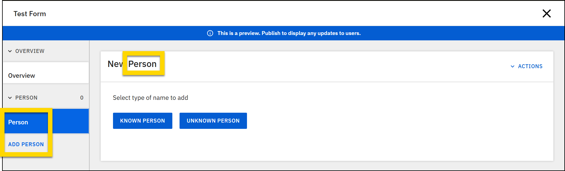
- Entity card: Cards with a set of predefined fields.
- Options include:
- Names
- This type of card will actually insert two cards: One for Persons and one for Organizations.
- Person
- Property
- Vehicle
- Names
- You can only add each entity card type once to a form. (i.e., A form can't contain two Vehicle cards.)
- Options include:
- Blank card: Empty cards you can customize by adding your own fields.
- Rich text editor: Cards that contain a large text editing area that lets users perform rich text formatting (such as adding bullets, headings, tables, etc.).
- Acknowledgment: Cards that contain a set of fields that allow users to digitally acknowledge their completion of a report.
To add a new card to your form:
- You can add a new card in one of two ways, depending on where you want it to appear in the form:
- To add the card to the end of the form, select Add card on the left side of the page.
- To add a card above or below an existing card:
- Open the card you want your new card to appear before or after.
- Next to the card description, select More actions [...] > Insert before/after.
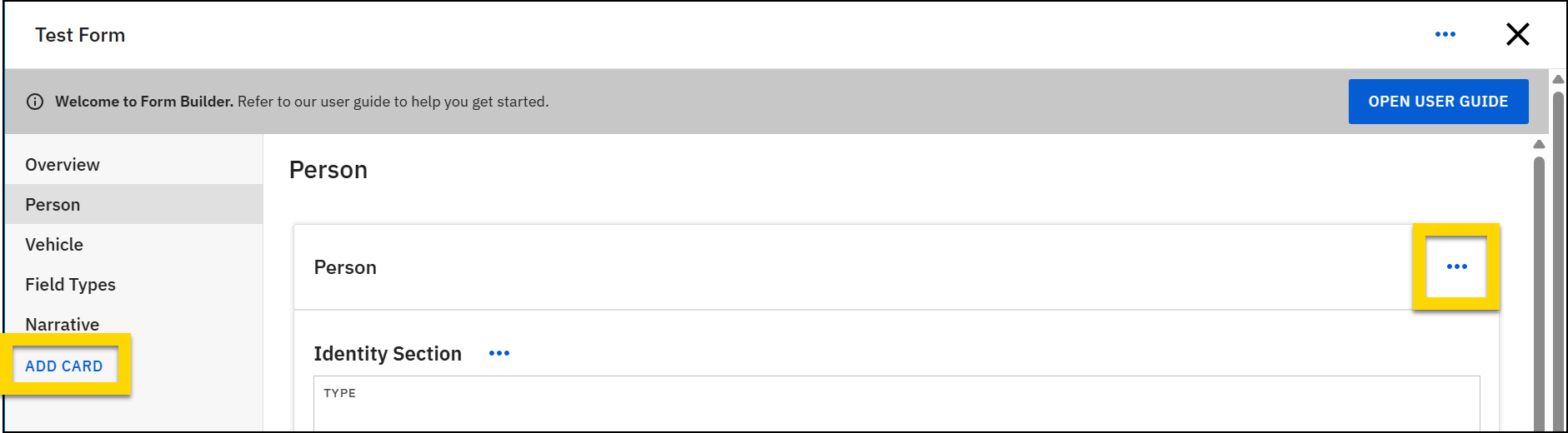
- Choose a card type (Acknowledgment, Blank, Entity, or Rich text editor).
- Enter a card title.
- This field only appears when you add a Blank card or a Rich text editor card. For the other card types, the card title can be edited later if you edit the card.
- The card title appears in Report Writer in the left navigation menu as the title for that section of the report, which can be expanded or collapsed.
- Enter a card description.
- The card description appears in three locations in Report Writer:
- The secondary item within each expandable section
- The Add button (only appears for Entity cards)
- The top of the central report writing area
- The card description appears in three locations in Report Writer:
- Select Add.
- After adding a card, you can add, edit, or remove fields.
- After making changes to your form, preview and then publish it.
Watch this video for an overview of how to work with cards using Form Builder.
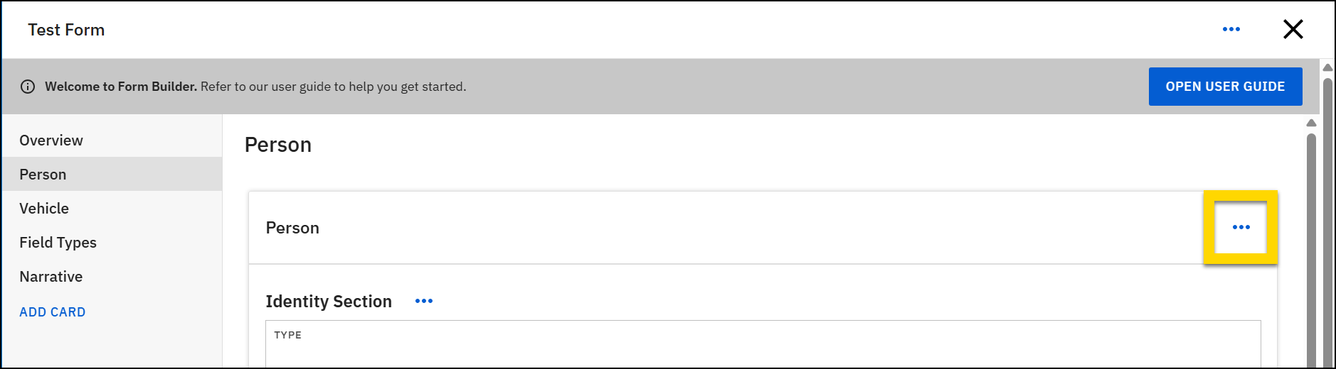
Edit cards
To modify an existing card:
- Open the card you need to edit.
- Next to the card description, select More actions [...] > Edit.
- In the edit mode, you can edit either the card title or description.
- Select Add after making changes.
- After making changes to your form, preview and then publish it.
Remove cards
To modify an existing card:
- Open the card you need to edit.
- Next to the card description, select More actions [...] > Remove.
- In the confirmation window that appears, select Remove.
- You cannot restore a card after it has been removed.
- If you remove a card and later decide you want to re-add it, you can do so. The card will be added to the form with its original set of fields.
Add new fields
You can add fields in several different locations on a card:
- At the end of a card
- At the beginning of a section or list
- At the end of a section or list
- In between two other fields
Watch this video for an overview of how to add and manage fields.
To add a field to the end of a card:
- Select the card you want to add a field to.
- Select Add [card title] field, at the bottom of the card.
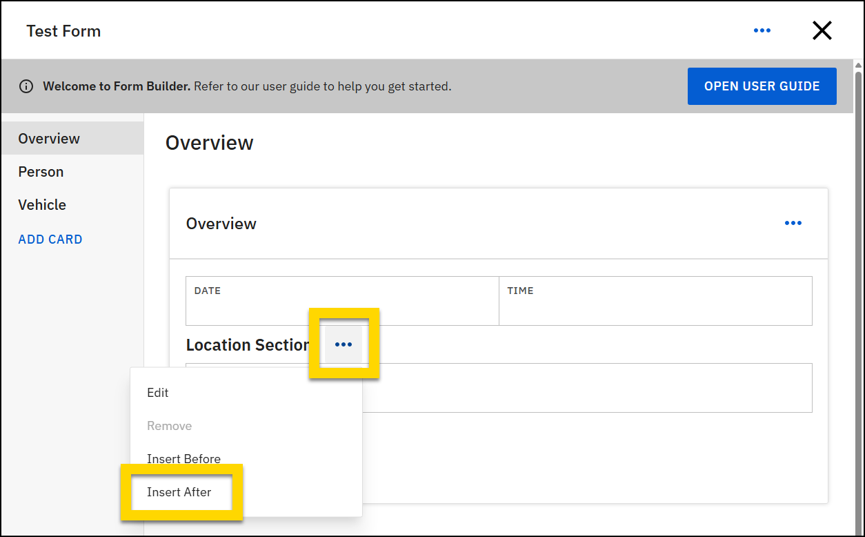
Sections and lists are types of field that can contain other fields. To add a field to the top of a section or list:
- Find the section or list.
- Select More actions [...] > Insert after beside the section/list name.
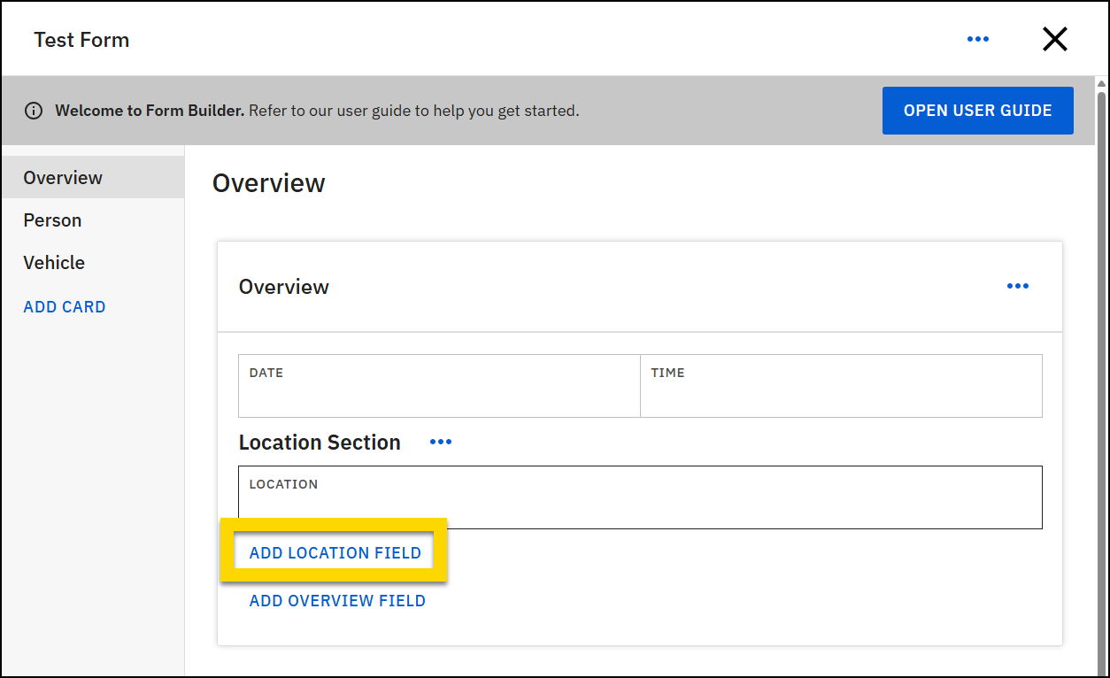
To add a field to the end of a section or list:
- Select the card you want to add a field to.
- Find the section or list you want to add the field to.
- Select Add [section/list name] field, at the bottom of the section/list.
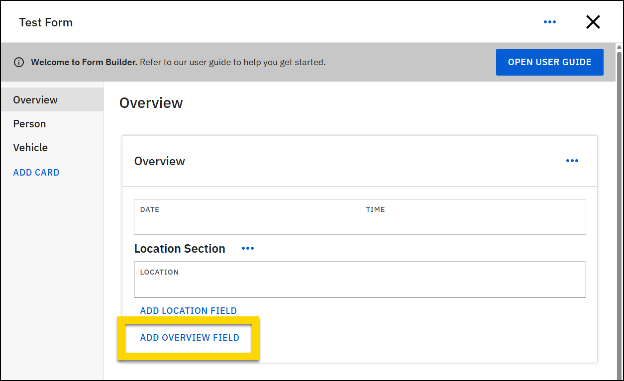
- Be careful when adding fields to a section/list that appears at the bottom of the card. Select the Add [section/list name] field button rather than the Add [card title] field button to ensure the field is added to the end of the section/list, rather than below it.
- For example, in the image below, to add a field to the Location section, you would select Add location field, rather than Add overview field (Overview is the name of the card).
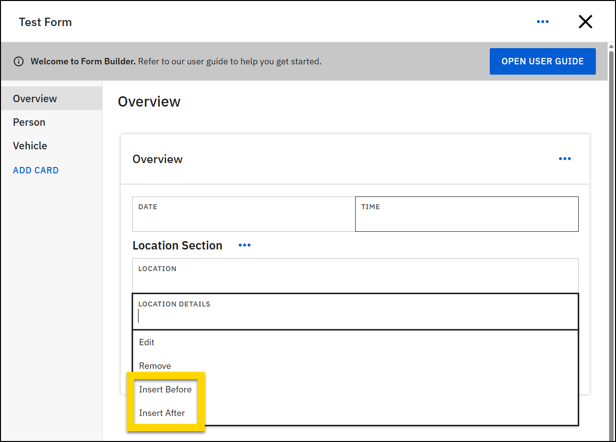
To insert a field between existing fields:
- Select an existing field.
- Choose Insert before or Insert after.
You cannot add fields in between existing fields on Entity cards. Instead, new fields can only be added at the end of the card.
Edit field details
After adding a new field, or when editing an existing field, adjust the field details, including:
- Select a field type.
- Select the Is this field required checkbox to make the field mandatory and require it to be completed by all users who write reports using this form.
- Incomplete required fields will trigger an error message and may prevent report submission.
- Enter a field title that will appear above the field on the form.
- Add a help message to provide guidance or instructions.
- This message appears as an information icon inside the field.
- A Help Message can be added to all fields except Date & Time, Description, Location search, List, Multi-line text, Section, and Subform fields.
- Choose a field width. This determines how much space the field occupies within the form. Multiple fields can appear on the same line until it is full.
- For dropdown or checkbox group fields add options.
- Add default values.
- This option appears grayed out for field types that don't support default values.
Remove fields
Certain types of fields cannot be removed from a form:
- Fields on entity cards. The data entered in Entity fields contributes to the Master Name Index (MNI), so fields cannot be removed from Entity cards.
- Fields that have been added by Axon representatives
To remove all other types of fields:
- Select the field.
- Choose Remove.
- Select Remove in the confirmation message.
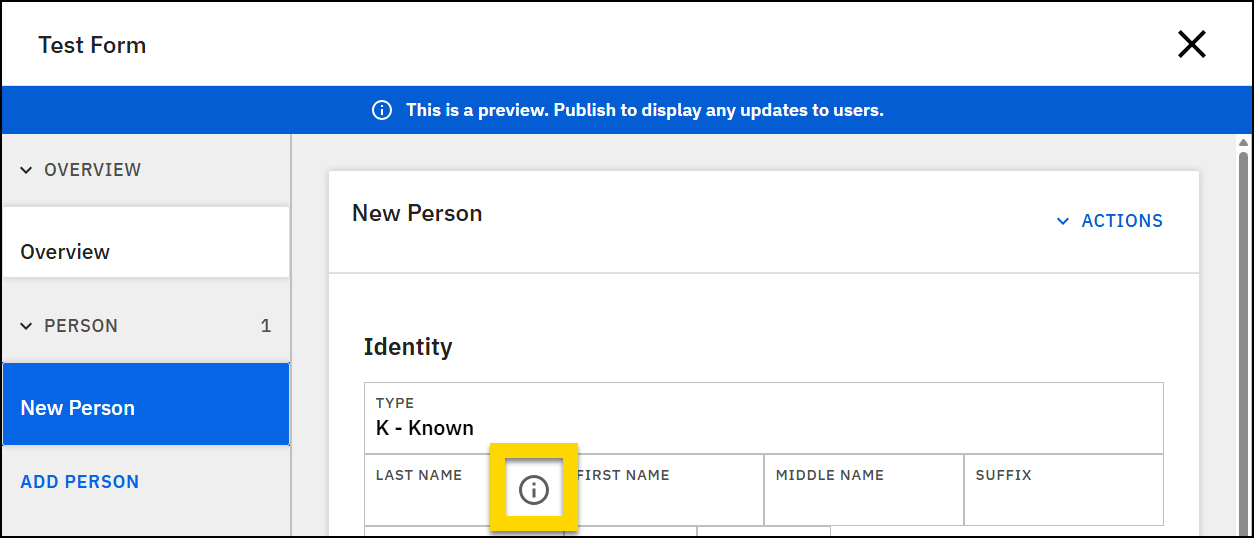
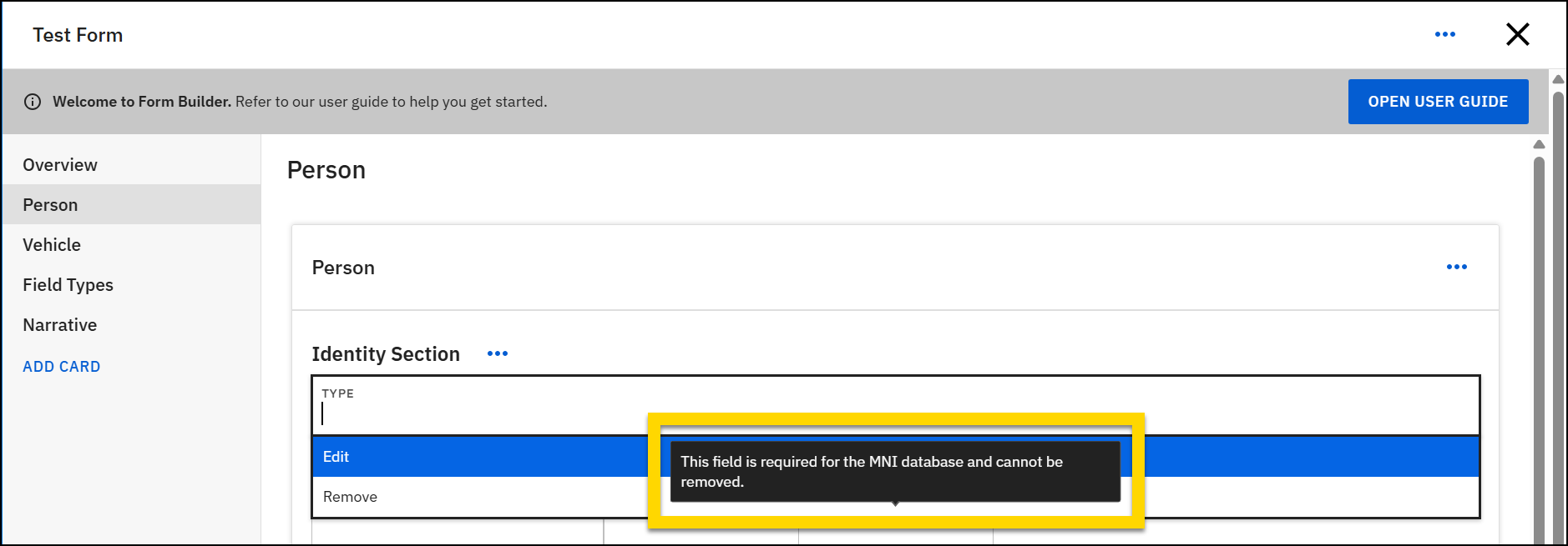
View protected fields
When editing a form, you may notice some fields are protected—meaning you can’t change or remove them. Hover over the Remove option for a field to see a message that explains why the field can't be removed.
- MNI-required fields: These fields are protected because they connect to the Master Name Index (MNI) database, which relies on specific fields. They cannot be edited or removed.
- NIBRS-required fields: These fields are protected to ensure compliance with NIBRS reporting standards. They cannot be edited or removed.
- Other protected fields: Fields that don't indicate they're protected due to NIBRS or MNI may be configurable. To edit or remove one of these fields, submit a request to Axon Support.
Field types
There are multiple different field types available in Form Builder as explained in the sections below.
Search
There are several different types of search fields available. When a user enters text in these fields, Report Writer searches the system database and presents results.
All Search fields are non-removable field types. Once you add and save these fields, you cannot remove them from your form.
Agency user search
This field lets report writers search for a user. The names that appear in this search are those who have accounts in Axon Evidence. For more information, see Adding a User.
Charge search
This field lets users search for charges or offenses. The items in this list come from your organization's Master Charge Table (MCT). Any changes to this list must made using the Master Charge Tool rather than in Form Builder.
Location search
There are two types of Location search fields you can add to a form: Event and Residential. The Location search field types include the following fields:
- Location: Options in this field vary between Event and Residential location search:
- Event search includes:
- Auto-address
- Manual address
- Cross streets
- Mile marker
- Unknown
- Residential search includes:
- Auto-address
- Manual address
- Homeless/transient
- Unknown
- Event search includes:
- Depending on what a user selects from the Location field, different fields appear. See GIS and maps for a full explanation.
Organizational search
This field lets users search for organizations that have been added to your organization's reports (and therefore to your organization's Master Name Index).
Person search
This field lets users search for people that have been added to your organization's reports (and therefore to your organization's Master Name Index).
Checkbox group
This field displays a group of checkboxes report writers can mark.
When adding a checkbox group, give a name to the group (displayed above the list of checkboxes). Then, select Add option to create multiple checkboxes. Checkboxes are displayed in a three-column layout.
Each checkbox option can include:
- Order: Sets the order in which the checkbox item is displayed.
- Lower numbers appear higher in the list.
- Axon recommends ranking the most frequently selected option as 1.
- The Order number indicates the order of the checkbox from left to right, not top to bottom. For example, if you set an option's order to "2", this option displays as the first option in the second column, not the second option in the first column.
- Option: The text displayed beside the checkbox
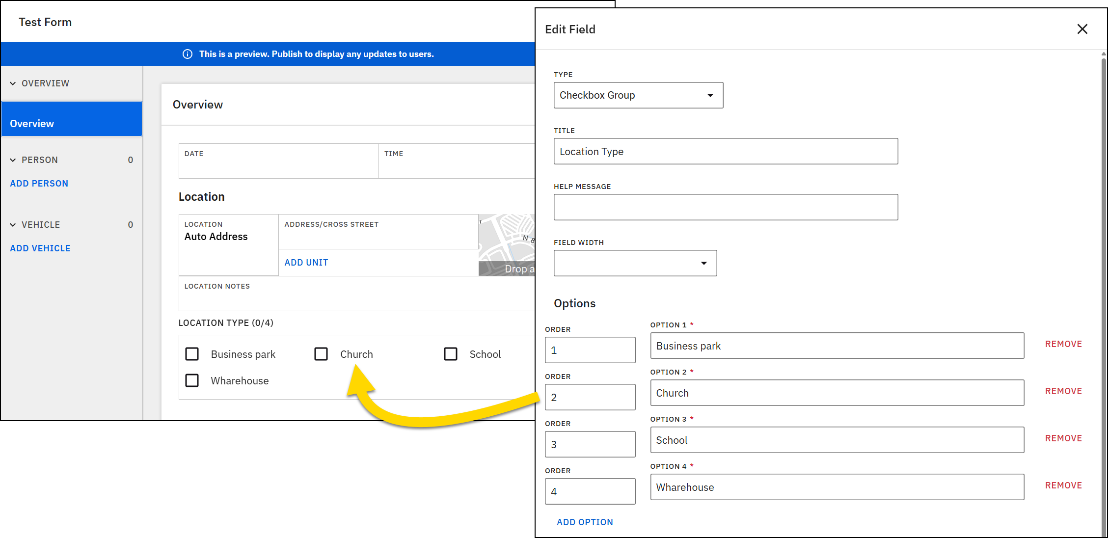
If you enter options in your preferred order initially, you don't need to set the display order manually.
Dropdown
A Dropdown field provides a list of options for users can choose from. Users can select only one option.
Like Checkbox group fields, when creating dropdown options, you can optionally set the order of the option as well as providing the option text.
Additionally, each option in a dropdown can have a short code, which is a short set of numbers and letters that are added before the option text. Adding shortcodes helps users who know the shortcode find that option more quickly.
For example, in a dropdown list of state names, state abbreviations can serve as shortcodes. Typing the shortcode "AZ" takes users directly to Arizona, while typing "WA" brings up Washington.
Auto-complete dropdown
This field is similar to the Dropdown field type, but it instead contains two available options: Flag categories or Incident IDs. If you set this field to Flag categories, users will see a list of all flag categories (e.g., Juvenile, Domestic violence, etc.) that have been created for your organization. If you set this field to Incident IDs, users can search the list of all Incident IDs that have been created at your organization.
Yes/No
A Yes/No field is really a dropdown field with two options: Yes and No.
Dates and times
There are four different field types related to dates and times:
- Date and time: When you select this field type, both a Date and a Time field are inserted into your form.
- Date: Inserts only a Date field.
- Time: Inserts only a Time field.
- Time with Seconds: Inserts a Time field that allows users to enter seconds in addition to hours and minutes. All other Time fields only allow entry of hours and minutes.
- Year: Inserts a Year field to capture a four-digit year.
Text
You can use two types of text fields: Single-line and Multi-line.
The Single-line text field is takes up a single line of space in the form. It is used to visually indicate that the content to be added to the field should be brief.
Multi-line text fields can take up more space in the form to indicate that the content to be added to the field can be more expansive. Enter a number in the Row field to set how much space this field takes up in the form. It's recommended to avoid entering too large of a number to prevent the field from taking up too much space. Entering "6" results in a field that is larger but not too large.
When working with your Axon representative or Axon Support on print templates associated with this form, make sure that the corresponding print template field is also set as multi-line to prevent text from collapsing into a single line when printed.
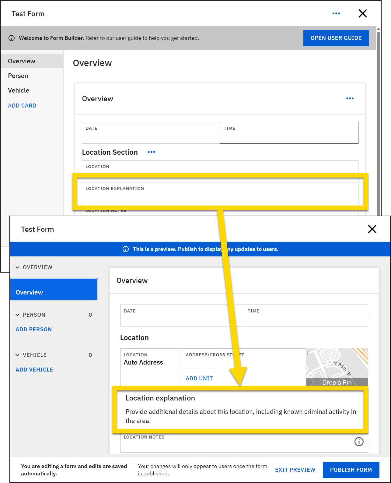
Description
A Description field is displayed as read-only text to users when they write reports. You can use this field to provide instructions or other information to help users complete their reports.
When creating the field in Form Builder, the title you create for the field is not shown in Report Writer by default. Select the Show title checkbox to make it appear.
Note that the text you enter in the Description field does not appear in Form Builder when you are viewing the form. Select Preview form to view the text.
Numbers
There are various number-related fields you can add to your reports. Many of these fields auto-format the text that is entered into them to ensure data consistency.
Height
Heights can be entered in this field. The numbers entered into this field are auto-formatted as height and inches. For example, if a user enters "54" in a height field, it is auto-updated to "5-04".
Number
Number fields let users enter whole numbers and decimal values. A common use for this field type is a Weight field.
Monetary
Monetary values can be entered in this field. The numbers entered into this field are auto-formatted to include a dollar sign ($) and two decimal places (cents). For example, if a user enters "100" in a monetary field, it is auto-updated to "$100.00".
Phone number
Phone numbers can be entered in this field. The numbers entered into the field are auto-formatted as (111) 111-1111.
Social Security Number
Social Security Numbers can be entered in this field. The numbers entered into the field are auto-formatted as 111-11-1111.
List
A list is a type of field that contain a set of fields. When a user encounters a list in a report, they can add multiple sets of those fields to their report.
For example, you create a Contact Information section in your form and add a Contact list to the section. This list includes four fields for first name, last name, phone number, and email. When users create reports from this form, they see an Add contact button. When they select this button, a set of fields, labeled Contact 1, appears in their report. They can complete these fields, and select Add contact again to add another set of contact information fields.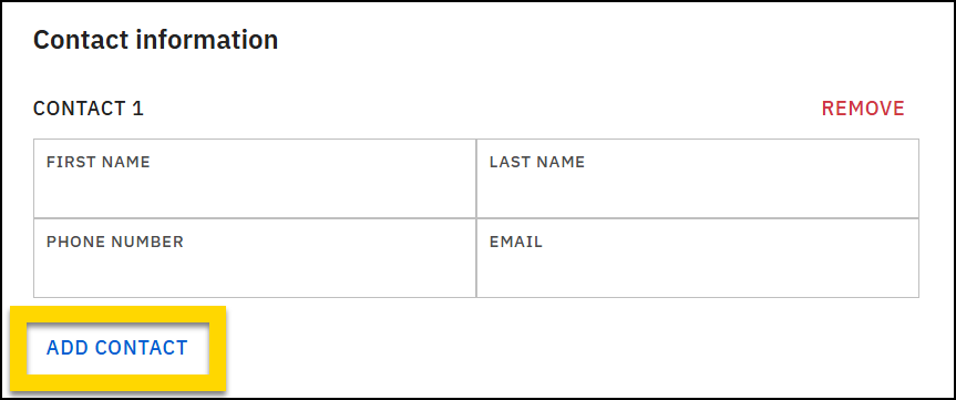
Section
Like lists, a section is a type of field that contains a set of fields. Sections can be used to group related fields together and introduce a clear visual hierarchy to your form. When you add a section, the field title you enter is displayed as a heading in the form.
For example, you can add a Location section that has a Location heading and includes various location fields, including Location search, Location details. etc.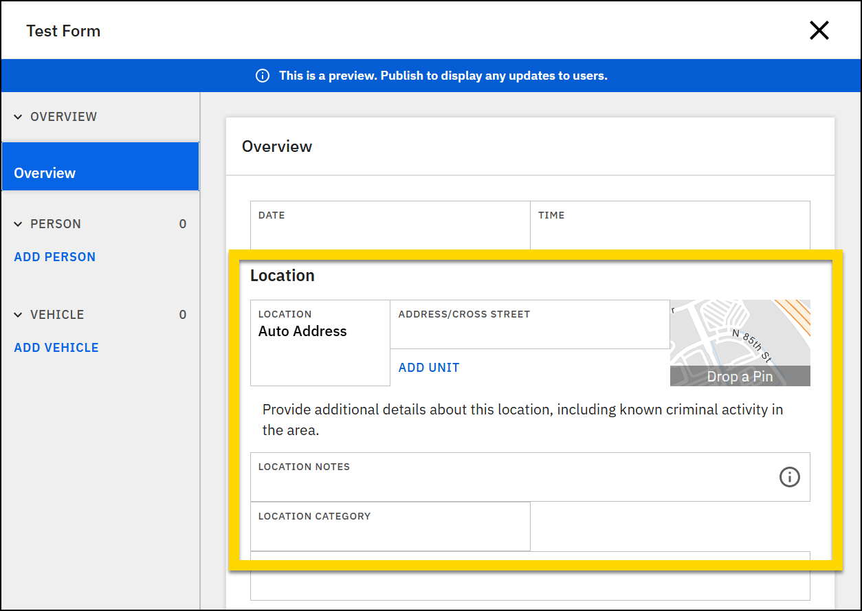
Field widths
The display of fields in forms is controlled using an “invisible” 12-column layout.
The yellow and blue bars in the image below highlight the “invisible” columns in an example form.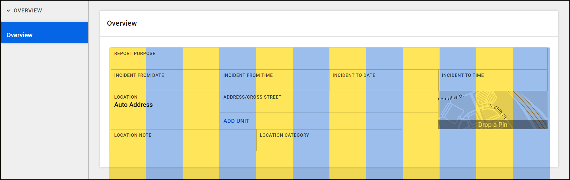
The Field width menu for each field indicates how many columns that field spans. The following options are available:
- 2/12: The field spans 2 of the 12 columns.
- 3/12 (Quarter): The field spans 3 of the 12 columns (or one quarter of the total width of the form).
- 4/12 (Third): The field spans 4 of the 12 columns (or one third of the total width of the form).
- 6/12 (Half): The field spans 6 of the 12 columns (or one half of the total width of the form).
- 8/12: The field spans 8 of the 12 columns.
- 9/12: The field spans 9 of the 12 columns.
- 10/12: The field spans 10 of the 12 columns.
- Full width: The field spans the full width of the form.
Field widths don’t apply to checkbox fields; these fields always display at full width of the form. Additionally, these field widths you only apply to the form in Report Writer. They do not impact print templates, which determine how the fields appear when a report is printed.
When you add fields to the same section in a form, they are added, one after the other, to the same row until all columns are “full.”
For example, in the image below, the width for each of the incident date and time fields is set to 3/12, indicating that each field spans three columns (taking up one quarter of total columns in the row).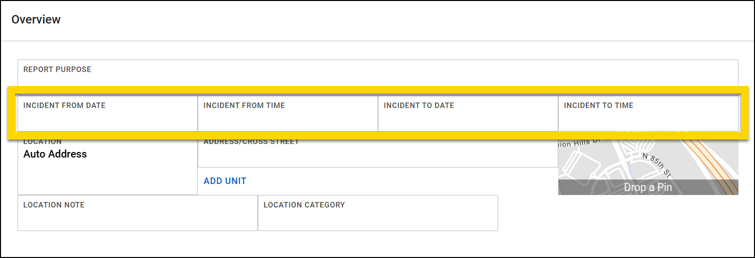
If you add a field to a row, and it won’t “fit” in the row because too many columns are already taken up by existing fields, the new field appears in a new row.
Example
In the image below, the Location note and Location category fields each have a width of 4/12, leaving four columns in the row. When the Location district field is added with a width of 6/12, it doesn’t fit on the same row as the other location fields and instead appears below them on its own line.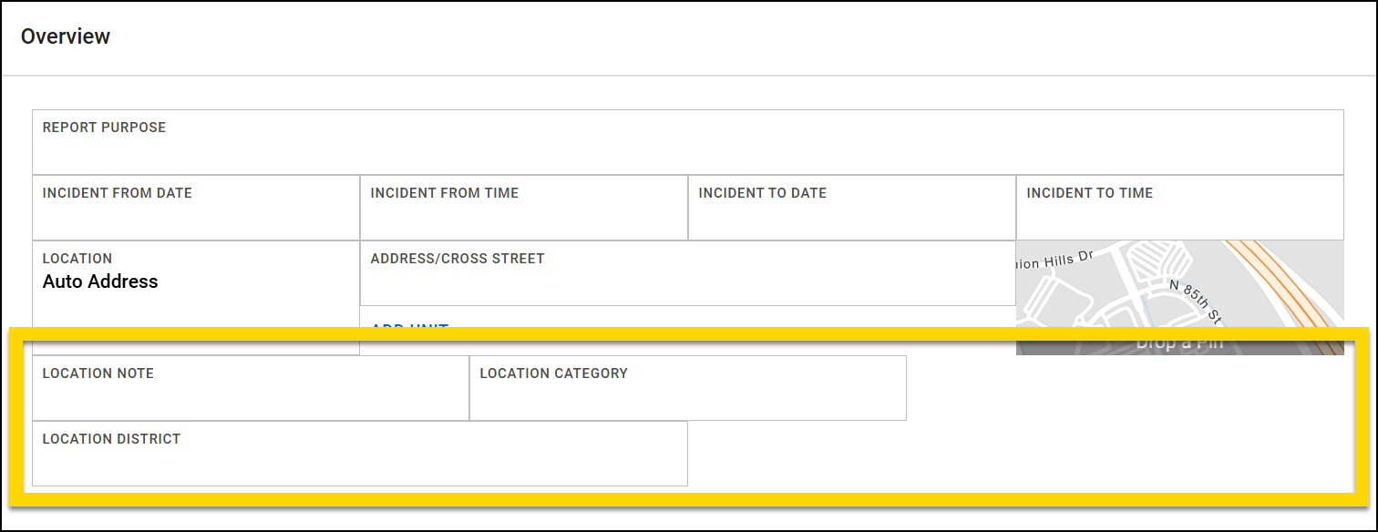
If the Location district field width is adjusted to 4/12, it is now the correct width to fit on the same row as the other location fields.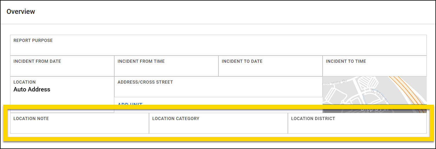
If the Location district field (still with a field width of 4/12) is instead added to a new section below the location fields, it remains in its own row, even though it could fit into the same row as the location fields in the section above it.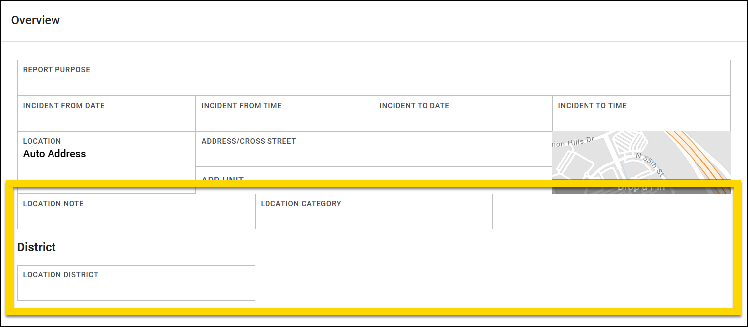
Default values
When you add a field to a form, you can set a default value for the field. When a user writes a report using your form and comes to this field, the field will be pre-filled with the default value you set in Form Builder. This feature lets you pre-populate certain field types with known information or common responses, helping to streamline the report writing process. When users write reports that contain default values, they can overwrite these default values with information appropriate to their specific report.
There are three types of default values you can choose from: Metadata, User, and Insert the value from another field. Default values are only available for some field types. If default values are not available for a field type, the Default values section is grayed out.
Metadata
This type of default value automatically fills a field with system-generated information, including:
- Linked Incident or Crash ID
- Linked CFS ID, arrival location, arrival date/time
- Current officer name, ID, age (i.e., the name, ID or age of the user writing the report)
When entering a User default value for a Single-line text field, enter the information you want to automatically appear in the field. For all other field types, select an option from the ones presented in the Default value field. For example, if you want your form to auto-select the first option in a Checkbox group, select this option from the Default value field.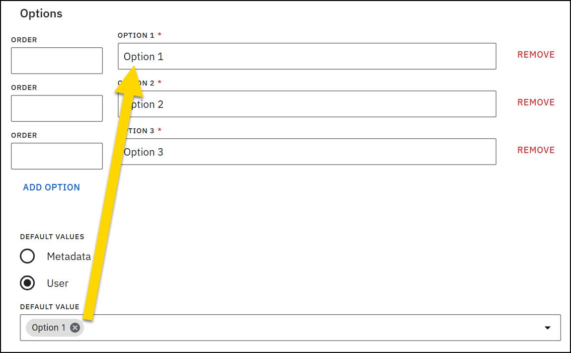
User
You, the Form Builder user, can create a custom default value that is auto-filled in a field. Report writers can modify this default when they are writing their reports.You can only add user default values for fields that are NOT related to NIBRS reporting.
Insert the value from another field
The field automatically pulls its value from another field in the form and is only supported for Single- and Multi-line text fields.
For example, you can configure the default value for Field B to be the same as whatever is entered in Field A (also called the source field). When report writers encounter fields with this type of default value in their reports, a refresh button is displayed on the field. If the source field is updated, a message can appear, notifying the report writer that the source field changed, and asking them if they want to update the linked field.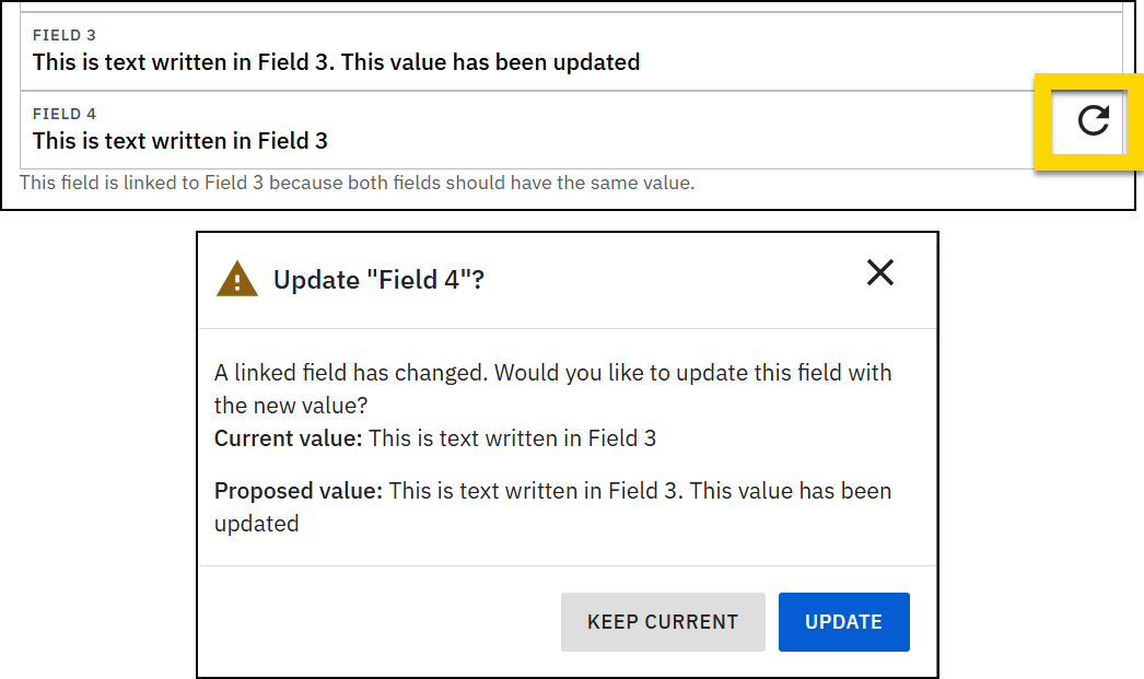
To add this type of default value to a field:
- Add a field to a form.
- In the Default values section, select Insert the value from another field.
- In the Insert value from field, select the other field the value should be pulled from.
- Optionally, select the Upon refresh checkbox.
- If this checkbox is selected, a message automatically appears to the report writer when the source field value is updated, indicating that the field updated and asking if they want the linked field to be updated to match.
- Optionally, add helper text that is displayed below the linked field, explaining why it is linked to another field.